Hello and welcome back to the blog! It's been about a year since we found out we were expecting a second baby so it seems fitting to circle back a year later with the nursery reveal! I also haven't blogged in about a year. Oops. Seems like morning sickness really got me off the blog horse and I never saddled up again until just now!
Anyways, we're back to give you a tour of this sweet little room at #casasaccullo ! And stay tuned until the end to get the look!
It all started as a very blah, empty box in our cookie cutter tract home here in the SF Bay Area. Here is a pic of the room before we moved in:
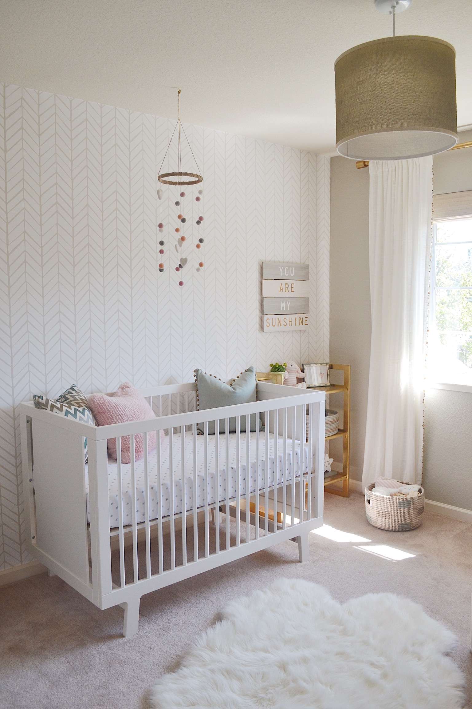
Whomp whomppp. Yup - just about as boring as it gets! Although it does have a great window that gets very nice morning light, I will say! And I've learned the hard way that it's all about light. Here is an after at a more zoomed in but similar angle:
A little bit better, right?
We moved to Casa Saccullo a little over a year ago, and if you follow me on Instagram you have probably seen some before and after shots of some of the work we did before moving in. We did a huge paint job which included this room, even though it was unoccupied at the time. We knew (hoped, prayed!) that it would one day be a nursery, so I of course opted to paint it my favorite neutral Benjamin Moore Revere Pewter.
My clients who are reading this are probably chuckling to themselves because they know that this is my favorite neutral color, like, ever. I know I sound like a broken record but it just never fails me! If you want to paint your room a beige/grey, or you're obsessed with greige (like me) and don't know where to start, I promise you that Mr. Revere is the way to go. And don't forget to do the eggshell finish. You'll thank me later.
We weren't finding out the gender of the baby (I know, I know, tough for anyone to do, let alone a designer!) but I was obsessed with the idea of doing a feature wall behind the crib. Since in Cali I've been taught by my clients that you usually don't hang anything above beds/cribs due to earthquake hazards, I felt like I wanted to add some dimension to that wall. Queue several weeks of obsessing/debating over wallpapers. I swear, I can pick out a wallpaper with the blink of an eye for a client, but when it comes to Casa Saccullo I am all of the sudden frozen in my tracks! Any other creatives out there who often have a block when it comes to themselves? You get so fatigued designing for others that when it comes to your own, you really have to conjure up the energy for a new creation. I'd imagine this also might happen for personal stylists, make-up artists, etc.! They end up wearing jeans and a black tee shirt every day and no makeup. You get what I'm saying?!
Anyways I should back it up for a minute, and let you know that I really wanted to reuse these custom pillows that I had done for our living room back in Brooklyn - you can see them on the sofa in the photo below.
I've always loved these colors and patterns, and figured with a nice dry-cleaning they'd be as good as new! So that was the palette that started off the design.
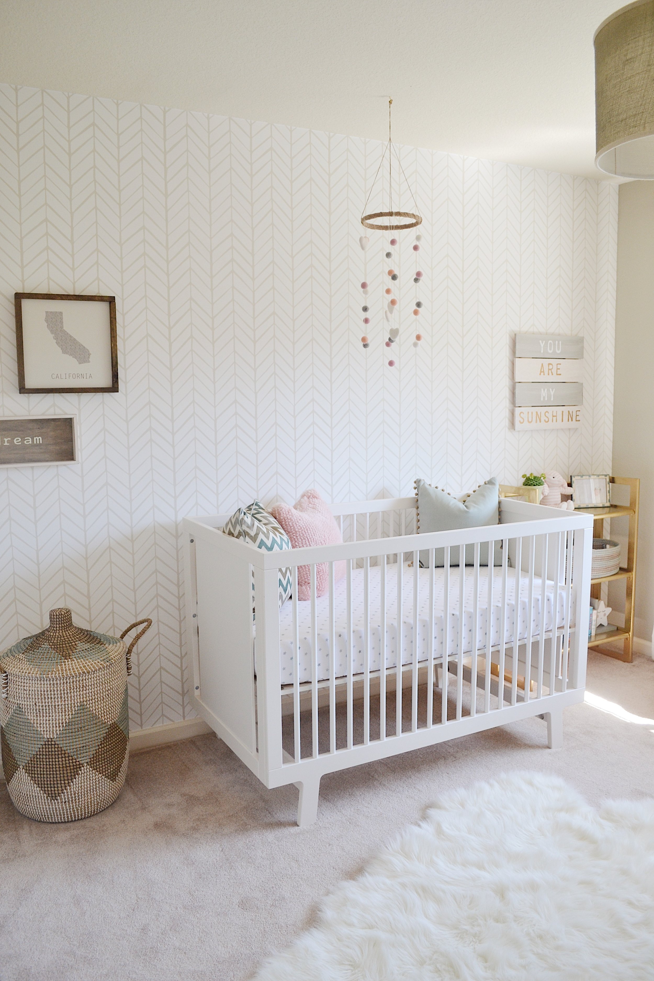
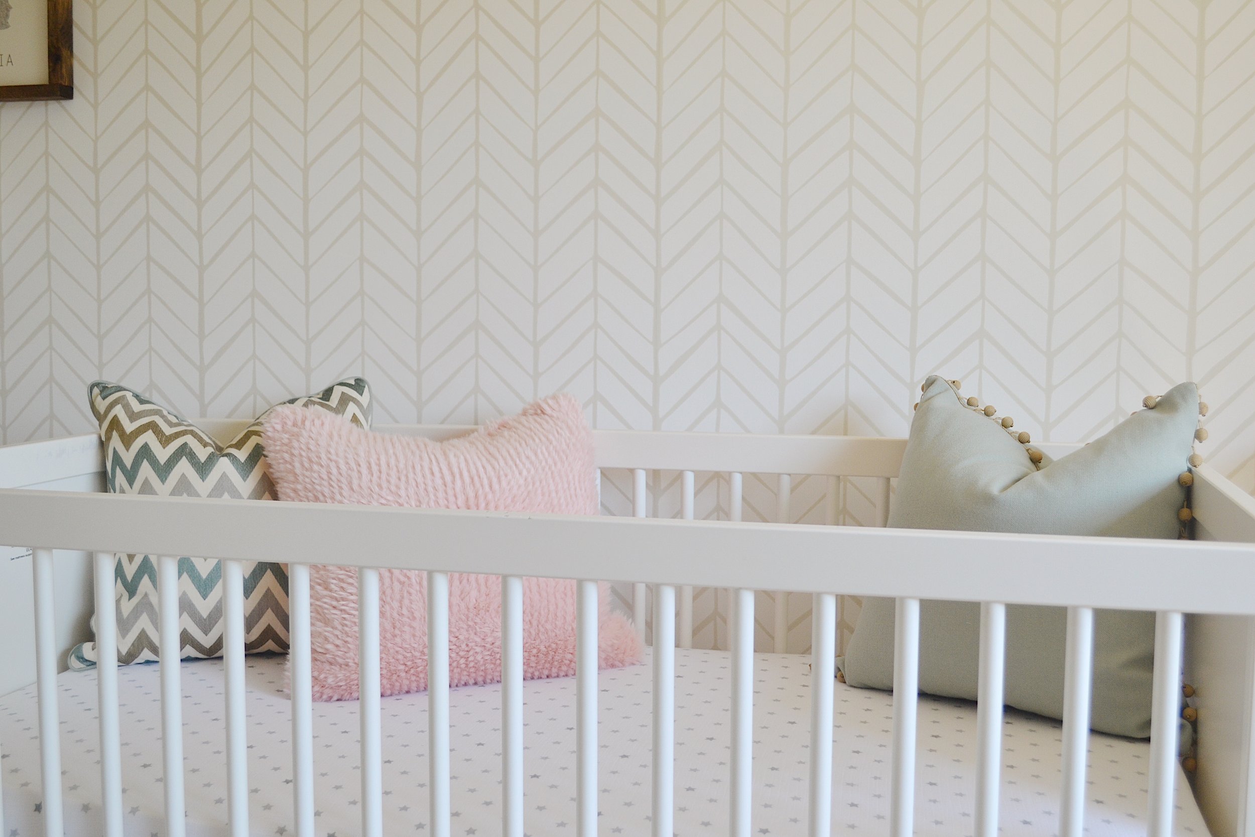
After a few weeks of agonizing over wallpaper samples, I got cold feet and could not commit to any papers I had first considered. #designerprobs. And although it's not reinventing the wheel, I ended up going with the Serena and Lily Feather Wallpaper in Bone. After spending a small fortune having the paperhanger re-drywall the accent wall so the paper would lay flat (Jeez, California with your textured walls?! Really?!), I'm thrilled with the result!
The good thing about having baby number two is that you likely already the crib, chair and possibly changing table. There were quite a few nursery items that (sort of?) survived the move across country with us. I still love this crib and definitely am glad we can use it again!
The upstairs of Casa Saccullo is graced with some unfortunate wall-to-wall brownish/beige carpeting. It's on the to-do list to one day either replace it with higher quality wall-to-wall, or just go for hardwood. TBD! For now, a great little trick is to throw a an area rug over it. It adds an extra layer of softness, and in this case some (faux) furriness, which both of the kids and dogs love!
And here are those pillows styled in the crib, along with a pop of furry pink once Eden was born.
The swivel glider was previously in Avery’s room, and I had the pouf made from the fabric of Avery’s old Roman shade that we took down when we moved. The little silver side table is from Avery’s nursery back in the day. The linen drum light fixture was in Avery’s room at our old house as well.
The curtains and hardware, which were in our guest bedroom at our previous home, were the perfect neutral touch for the nursery. Love the textured linen, capiz shell trim and brass rod to jazz them up a little.
Since we already had most of the big pieces in place, I challenged myself to filling in with fun and relatively inexpensive pieces to give the room some personality. Once Eden was born I of course wanted to incorporate some pink into the room! I really love the way the rose and peachy pink tones in this handcrafted mobile work with the minty aqua in the color scheme.
Also while preggers I scored these cute little rustic signs and light up moon light which could work regardless of gender. (And hey, if the baby had been a boy I just might have still used my pink accent, because, transcending gender stereotypes?)
Can one be in love with a basket? Because I think I've fallen for this one under the signs here. It matches the pillows perfectly and provides ample storage for toys. I'm sure the toys will eventually move to the playroom and this basket will be filled up with lots of little dolls and stuffed animals if Eden is anything of a stuffed animal hoarder like Avery!
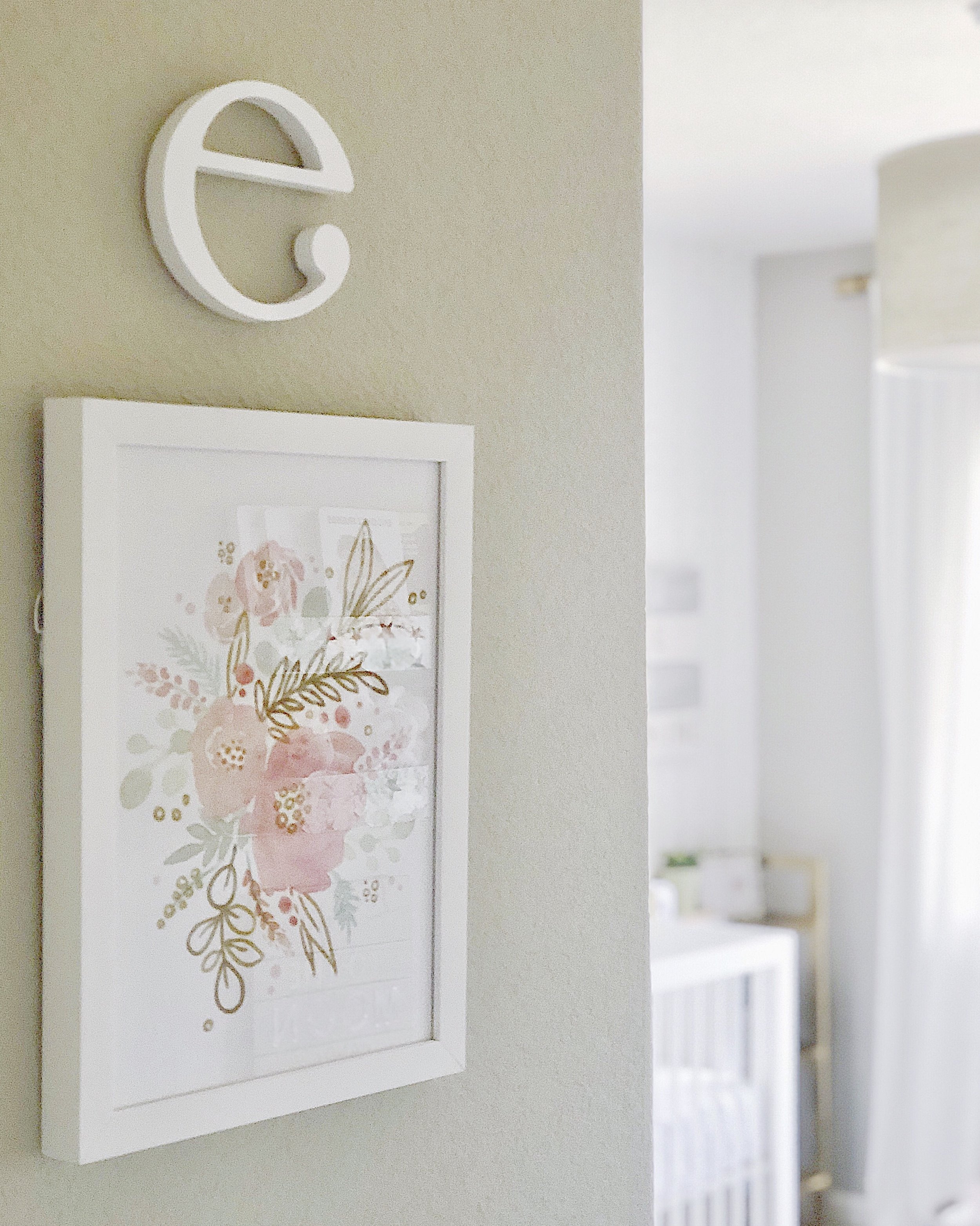
Another cute rustic sign to go with the dreamy/celestial vibe as well as a picture frame that used to be in our old living room, and of course a little touch of greenery with the succulent (need to blog about my succulent obsession!). I'd never seen this kind before, but the peachy little flower buds on it add just the right little touch of girliness.
The bookcase was a fun little DIY. I found it on Facebook Marketplace for about $30! Here is a link to what it originally looked like. With some simple gold spray paint, it's now a jazzy little bookcase, making good use of the corner next to the crib.
Another little cozy corner of the room. I got so excited when I found this throw blanket, since I love stripes and it pulls together the color palette. It's also super soft and warm for late night feeding snuggles. A mix of wood, burlap and lucite shelves above the chair mix it up for some additional wall storage.
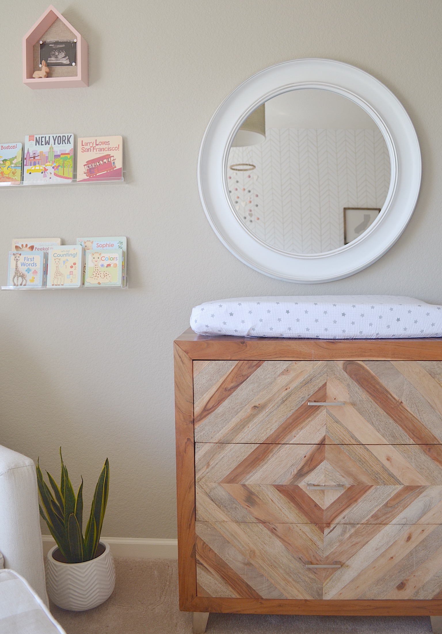
This dresser used as a changing table was the find of the century for only $250! It's solid mango wood and the diamond/herringbone pattern pulls in the chevron from the wallpaper across the room, as well as the touches of chevron in the pillows. The drawers are sturdy and nice and deep! I topped it off with a simple white mirror as not to compete with the gorgeousness of this wooden treasure, but always love to have a mirror above a changing table so the little one can admire themselves in all of their cuteness while on the changing table!
I'm a total sucker for stars, so you'll see that in the crib sheet and the changing pad cover - both by one of my favorite baby brands Aden and Anais. You'll also see stars in the galvanized metal star shelf housing lovies, rattles and the Eric Carle book collection. Another little rustic wood sign, a peach flower blossom and a woven hamper basket add a natural touch.
And not to be a cheese ball (although they say the moon is made out of cheese), I love this little girl to the moon and back!
Photocred: Lyndsie Smith Photography
Get the Look!
Click on the tiles below to shop:
Thanks for coming along on the tour! Let me know what you think in the comments below.
~LS
Photocred: Lyndsie Smith Photography

