Hello and welcome to LS Interiors headquarters, where the magic happens! ;-) And by magic, I mean squeezing in work on the fringe hours (like 7am - 8:15 and then again 4:30 - 10 pm), because of the C word, which I can’t even stand to mention at the moment. These new stay-at-home-working-mama-home-schooler hours are what have allowed the office to even be this clean to photograph and write about, so there’s that!
Anyways, since our homes have become most of our offices pretty much overnight, I thought I would give you a little tour of ours. Next week, I’ll share with you some tips and ideas on how to create a peaceful and personalized workspace for you during a time when you might find it (just a tad) harder than usual to focus. I’ll also link to the same or similar sources for the products you see in this space. So stay tuned for that, coming soon!
Now back to the office. It all started way back when in 2016 (when you could still stand closer than 6’ to people) when we saw #casasaccullo for the first time. Part of the reason I fell in love with the house was the home office. Even though it just looked like a badly staged box at the time (with a smoke alarm for ceiling light?), there was something about the space that I really loved and could visualize being The Office. The natural light was good, especially in the morning (much needed when you are looking at colors, fabrics and finish samples). I also loved that it was right off of the entry. If clients ever needed to come by, it felt like it was centrally located in a great spot where I could even see out the window to the front/driveway.
Here is what the space (which is roughly 11’ x 12’ at it’s largest dimensions) looked like before we bought the house:
BEFORE
Just sort of BLAH with no dimension. Here’s what this angle looks like now (almost four years later!)
AFTER
This space is 100% me, and it’s such a peaceful haven. It makes me happy every time I walk in. Or even when I just walk by (approximately 8 million times a day when I’m chasing a toddler around in circles).
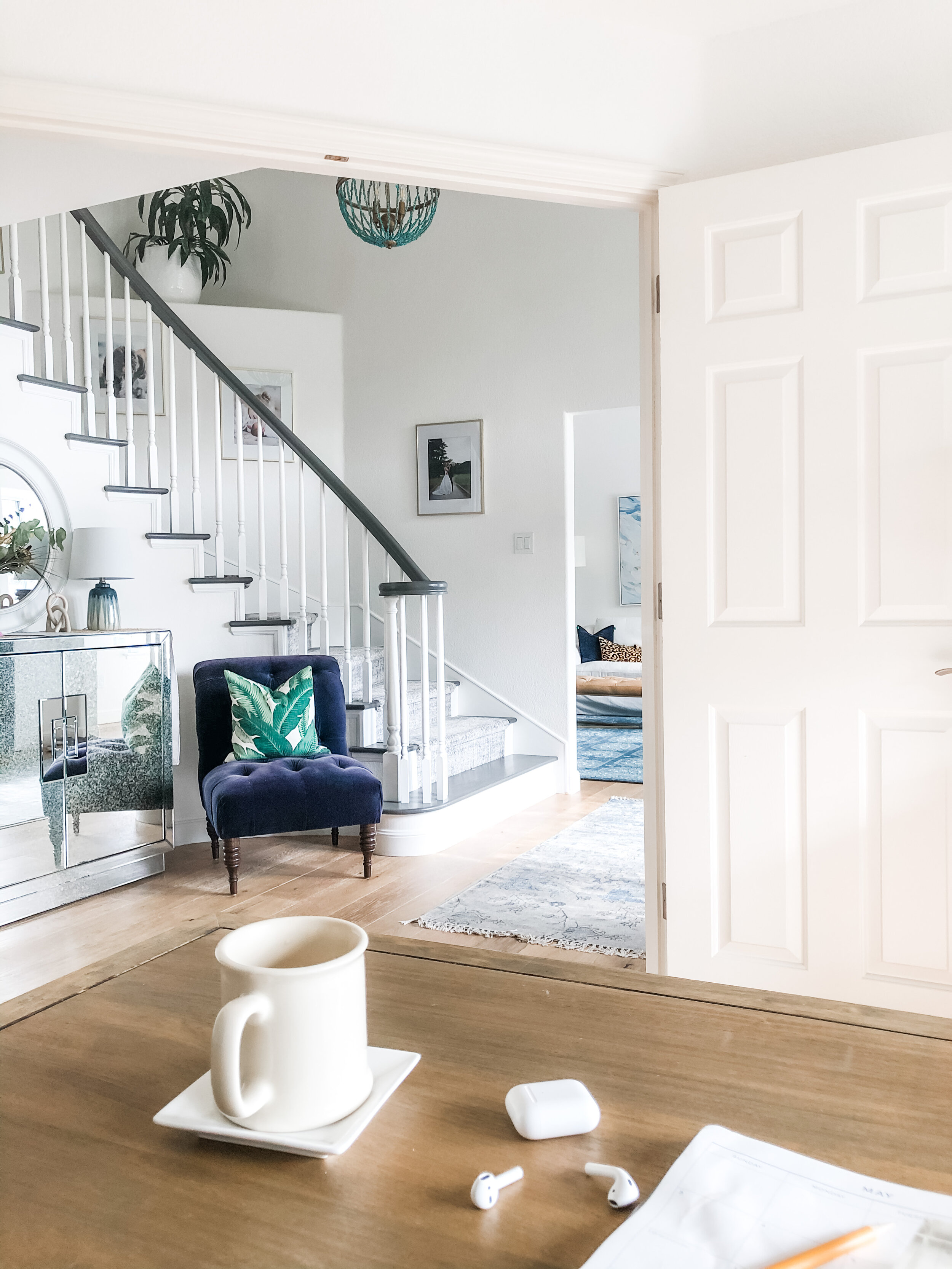
Since it’s off the main space of our house and can be viewed from the staircase, the living room, and the foyer. It had to be pretty AND functional. I will be the first to admit I have rearranged this space about 25 times over the past four years and I finally think I have landed on THE layout.
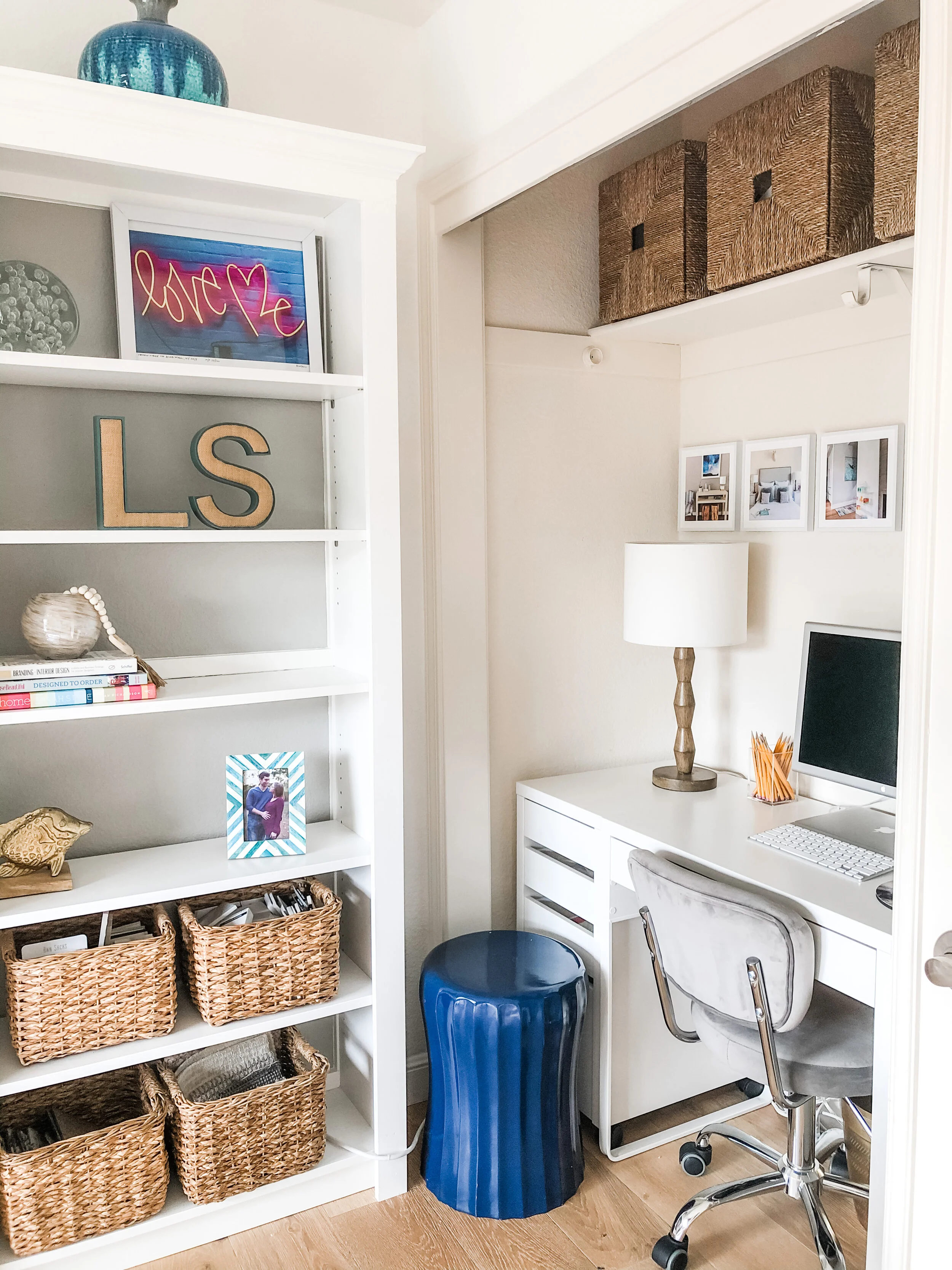
The rug is unapologetically pink and the bookshelf displays are unapologetically girly. The objects on the shelves are books, photos, accessories, art, and pieces of nature - things that make me happy. And since I have a pottery-buying problem, my favorite vases are displayed on the top of the shelves. Baskets conceal (most) of my material samples on the lower levels of the shelves and are also easy access right behind the desk.
But I’m getting ahead of myself. As I mentioned, the space is pretty small, and for a home office of an interior designer (the queens/kings of sample hoarding, vendor catalog hoarding and just generally needing STUFF to get work done) it’s a challenge to keep it all organized, pretty and accessible. So, I knew right away that I needed to maximize every inch of this small space with shelving.
Before we moved in, we replaced the flooring on the first floor and painted the majority of the space Benjamin Moore Chantilly Lace. I switched out the lovely smoke alarm light fixture and I had our contractor build out this faux built-in. Its basically four glorified ikea billy bookcases. He simply added molding, left off the particle board backs of the bookcases and instead painted the backs of the bookcases Sherwin Williams Pale French Gray, which can be found in a few other places in our home, to tie everything together. I chose the billy bookcases not only because they were affordable, but also very narrow in depth. at 12”. In a small space, every inch counts. I was already taking away a foot of space here, but gained so much storage and visual dimension that it was absolutely worth it.
As the biz grew over the past few years, I knew I needed to add another desk space for an intern and/or assistant. So, I had our handyman take off the closet doors, which were basically serving no purpose, and I created this little desk nook as a secondary workspace:
Again, ikea to the rescue here with the affordable small space furniture. They always seem to have the perfect simple, modern, small scale solution. As a designer, you have to get creative with your sources. It all depends on budget, size constraints and aesthetics. I am not too proud and will source anywhere from ikea/thrift stores to high-end, custom, trade-only options. It just depends on the project. Because of ikea, I was able to fit two file cabinets plus a desk in the closet nook as well as four large storage bins to hold odd sized samples (mostly tiles and flooring samples).
In the future (because as a designer, everything in your own home is ALWAYS a work in progress), I think I want to paint the wall in the closet nook the same Sherwin Williams Pale French Gray OR do a fun wallpaper. TBD. Let me know what you think! Could be a fun quarantine project while I put the kids in front of Frozen for the 828th time.
Moving right along to the next wall of this small space. Again, ikea for the win with the kallax storage bookcase. This piece is SO versatile and has lived in three different rooms in our house already. It’s the perfect place to store all of the big/odd sized vendor catalogs that I really love to have printed version of. Call me oldskool, but it’s just really not the same to look at the online versions. Sometimes I even just need to just SEE them. Simply looking at the spines will remind me of vendors to source from if I get stuck in a sourcing rut.
The two dark wood file boxes conceal office supplies like stationary and printer paper. The two (mismatched!) baskets at the bottom house paint decks and samples and also overflow office items. The top of the cubby allows for more surface area, and is home to my client folders, printer and lamp.
I was going to clean and pretty-up this area before pictures, but then just decided to capture it in the raw. You’ll see that the large scale bulletin board (which I LOVE) is a jumble of pictures of my kids, school schedules (so sad, no longer applicable!), art my kids made, and random samples. The macrame hanging planter is a handmade gift from a friend, which makes me so happy.
Next wall of the tour :-) … The big window that looks out to our front yard (and in typical Cali style, a big ole redwood fence). I had some fun with the window treatment here and took a chance on a gray painterly pattern with a green border. I love how it came out. It’s also blackout in case this ever needs to be an air mattress sleeping space for a guest.
Next, let’s talk about the desk. I love the campaign style, which features clean lines and the X-base. I really fell in love with this one, and I’ll link to it for you next week.
On a normal non-quarantine day, when the kids are at school and the husband’s at the office, I work with the doors open to the foyer to expand the space and light, and I love looking out from the desk into the foyer and living room. Lately I have been hiding out in here with the doors closed and earbuds in when I am given a quick break though! Do you blame me?
As you can see, every square inch of the space here is utilized, and here is where the small rugs and rug samples live. A pretty way to display them, and also a way to visually see what I have.
Well, there you have it! This concludes the grand tour of this tiny but mighty space. I hope you enjoyed!
Next week, I’ll share with you some tips and ideas on how to make your workspace feel personalized, peaceful, and productive, and most importantly 100% YOU.
~L.S.


